I’ve worked with this client before, two years ago I re did two living rooms & dining room. She was a dream client then and she was even more dreamy this time around. I met with her about her and her husbands bedroom. It was designed 20 years ago and they felt that it was time for a change. My client is traditional so when coming up with the design concept for the bedroom, I decided to marry rustic with traditional. I liked the potential of what that combination could bring. So I started off by sending her three concepts;
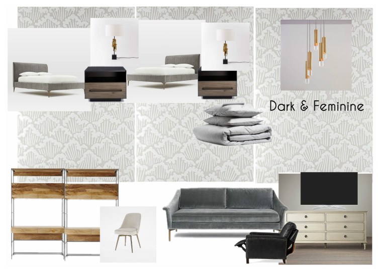
Dark & Feminine was more catered toward the husbands taste. I brought in pieces that were moodier in color or fabric and kept the backdrop more traditional with the wallpaper and color scheme.
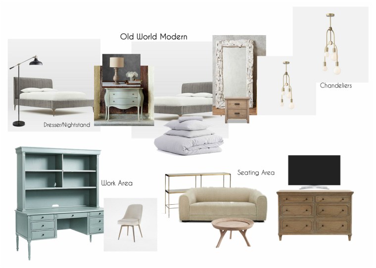
Old World Modern played up the traditional shapes with more rustic shapes. This was like an exaggerated version of the two styles combined, which I really liked.

Then came Effortless Tradition which was my favorite and the client’s favorite (I love when that happens.) It was a softer take on everything, with a muted color palette, different colored woods and all fabrics in linen.
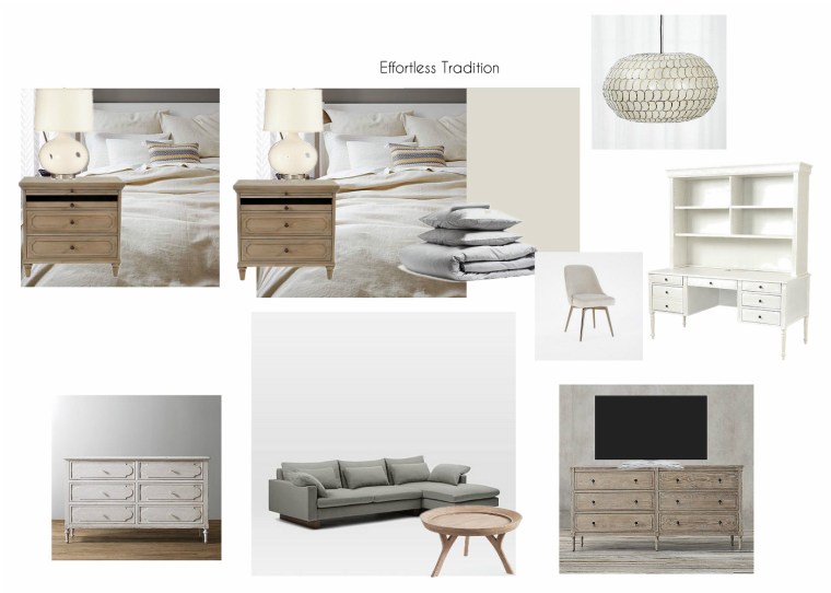
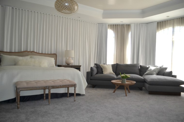
The client and I tweaked it a little bit before moving ahead. She liked the idea of a sectional sofa rather than two chairs. The desk was nice but didn’t offer enough storage so I changed that to a hutch. The hutch gave the client more storage and also added more tradition to the space.
So now that we’ve decided on the direction we’re going for the master bedroom, we need to start ripped apart the old look. Let’s see the starting point for this master bedroom;
BEFORE
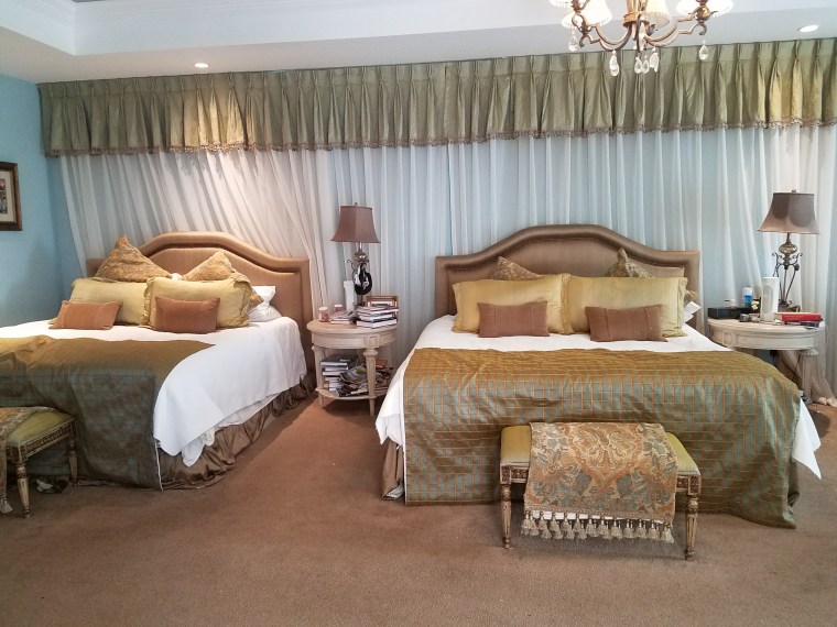
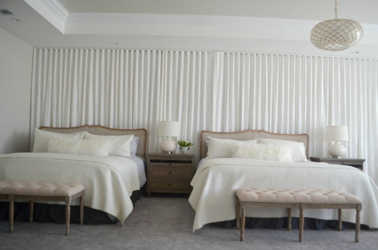
So this bedroom is clearly in need of a change. Behind the two beds are two very small windows, if you look closely, you’ll see black out curtains behind the sheers, those small areas are windows. When the client moved into the home they put drapes across the whole wall to distract from the small asymmetrical windows. So we wanted to keep the drapes installed the way they were and just switch out the fabric. There was so much to do in the bedroom – New beds, new benches, new night tables, new lamps, new ceiling light, NEW CARPET!! I was overwhelmed with excitement to get my hands on this room.
AFTER
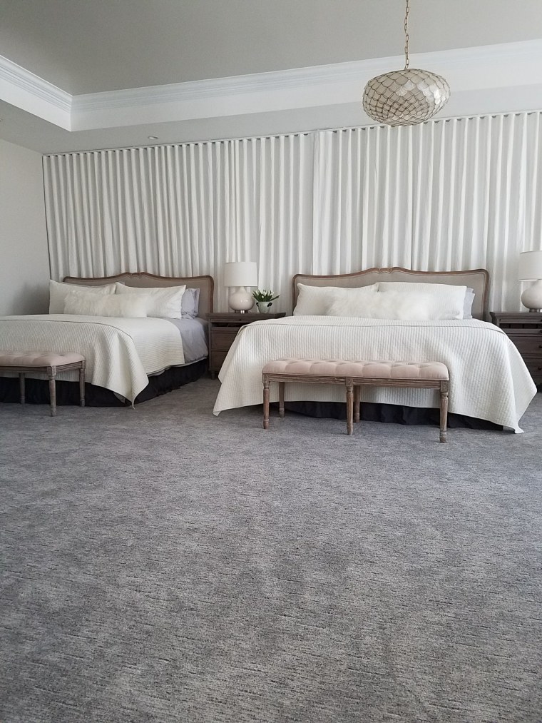
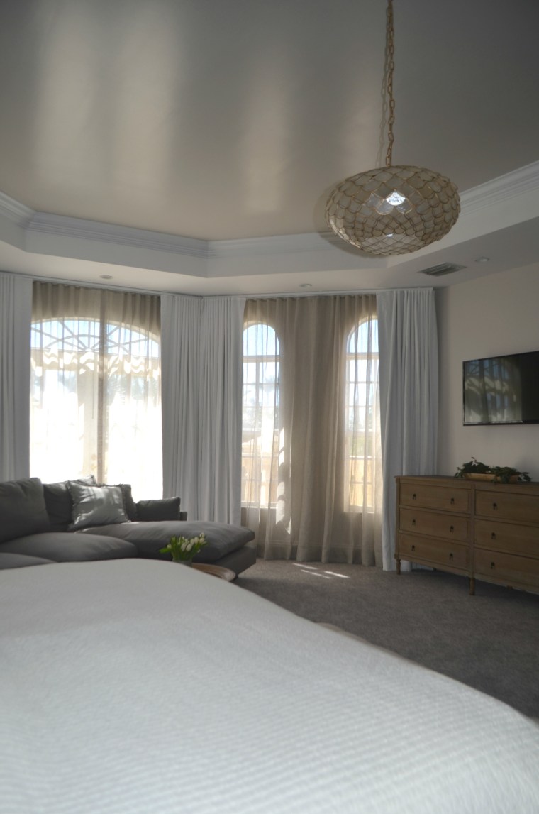
The fabric we used for the curtains was a white linen, which adds so much richness to the bedroom – I love it! When working in this room, I started with a very neutral color scheme to keep my clients husband happy (I happen to also love a neutral color scheme.) Once we nailed the colored schemed, I layered on a more feminine shapes to balance it out. The lamps, bed frame, light fixture and tufted bench all work really well in this setting and everyone is happy. FYI had the Mongolian pillows on both beds been any other color other than white – they would have been “out” as our German friend Heidi Klum puts it. The client’s husband wasn’t a fan of the “foofy” pillows but is now happy with the way it all looks. It blends so well you can barely see all the “foofiness” – his word.
BEFORE

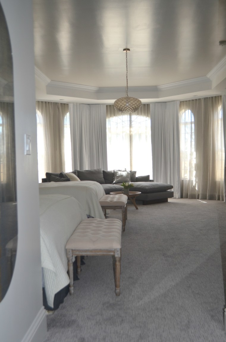
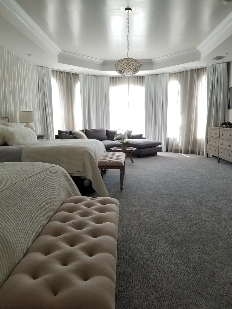
Let’s take a moment to address the size of this bedroom – it’s HUGE! Look at those beautiful bay windows and how wasted they are underneath all those tassels and organza. I simultaneously love the word organza and hate seeing it in a space. The drapery was installed by layering black out curtains first and then sheers on top. Which was more work when opening and closing curtains, you needed to open or close sheers before you were able to use the black outs. And the blackouts right in front of the windows hid those beautiful arches.
AFTER

It was a really big priority to have beautiful drapery by the bay windows and also show the arches – you cannot hide arches. Arches are beautiful in any and every context. When we installed new drapery, we put the sheers first and then layered the blackouts on top. So if the client wanted to let in light while also having privacy, she opened the black outs and the sheers were there to give light, show off the arches and provide her privacy. This is what the young people are calling a “win win.”
BEFORE
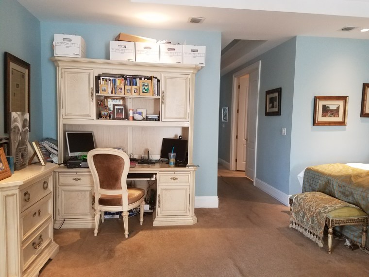
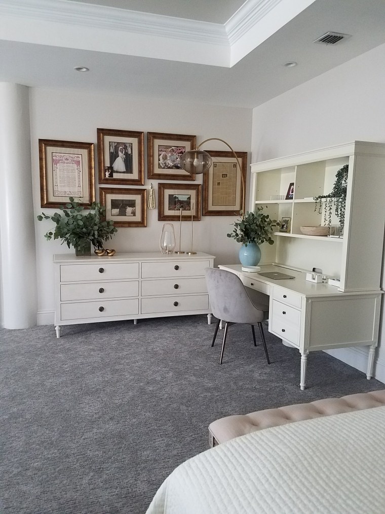
I also decided to take all the framed pictures scattered around the room and create a strong focal point. Each picture meant something to my client so I wanted them to be showcased in a better way. When we were done with gallery wall my client said, “it wouldn’t be a gallery wall by Chana if there weren’t hanging beads.” I looked at her teary eyed and said “Yes! You get it!”
AFTER

The layout from Before and After aren’t that different at all but the furniture pieces are more modern so it feels more fresh. Like a fresh salad. The hutch I chose has open shelving instead of cabinets on top and it also comes off the ground with fluted legs which gives it a lighter look. The dresser also accomplishes this with the legs bringing it off the ground and changing both pieces from a yellow /beige to white helps a ton!
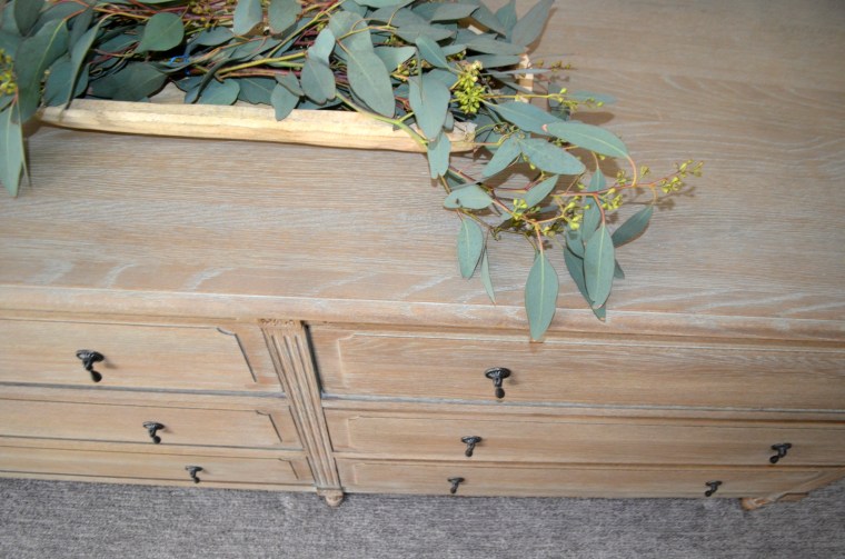
I loved breathing new life into this bedroom. It was a pleasure working with this client again, it makes me to happy that she now has a beautiful space to escape to at the end of each day. Here are some more pictures of the room, Enjoy!
